


15km from Moscow there is a country house in an old Russian picturesque village near pine forests and a small pond. As the country house is close to Moscow, it was supposed to be a permanent home.
When Irina first saw the location and the house she was impressed by the surroundings and the shape of the house. It turned out to be a round house; manufactured by a Canadian company that specializes in round houses that was brought over to Russia 25 years ago. It was old, poorly planned inside, a bit abandoned and obviously needed reconstruction but overall, the size and the shape were perfect.

So, when they started the reconstruction, they preserved the shape of the house but added the veranda around the front side of the house. Despite its rather big size (400 sq.m) it looks very tiny from outside and has a bit of a yurt in its shape.
The house only looks round; however, it consists of 20 similar triangle sections thus it doesn’t have curved or round walls inside.
Except for the roof, the house was demolished and re-built anew from similar materials, but the floor plans and the inner areas were changed completely.
The most important for Irina was to let in all the beauty of the nature outside and, to let in the natural light as the living room had sun from dawn till sunset. That is why they made 6 big French windows in the living room and didn’t put curtains on them, so the view wasn’t covered.

Another considerable drawback that the old house had was the ceiling – the height was hidden behind the boards and the total height was not more that 2.5m. When they dissembled the ceiling and saw the real height, Irina wanted to keep it open and make it part of the design.
It was a time-consuming and a very complicated process to renovate and plaster all the beams and make their shapes straight and regular. But they did it and now the ceiling looks amazing and is a part of the design. It gives huge space and air to the living room. Irina coloured the beams in white but the surface over the beams in dark greenish color which added depth and endlessness height to the house.
The floor is another unique feature as a dutch floor producer company was used called Bolefloor. Their slogan is ‘Life is not a straight line’ which matched the concept of the round house. You can not miss the shape of the floor when entering the house. The interesting thing was that the floor was produced exactly for the area and each board came with its unique number, and the workers had to assemble them like a puzzle, so there was no room for a mistake.
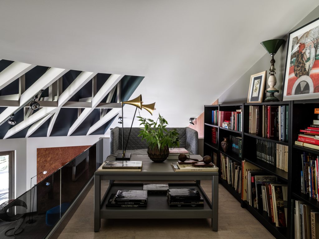
It is a two-storied house; the ground floor of the house consists of the specious living room, kitchen, master bedroom with bathroom as well as a wardrobe, and a kid’s room with bathroom and wardrobe. Both the kid’s room and the living room have mezzanines which is used as a small library in the living room.
The basement floor has a cabinet, a music room, a playroom, a guest room, a technical kitchen, and secondary rooms such as laundry, warehouse etc. It also has natural light but the windows are small and requires more lighting.
The house is built on contrast of colors. The combination of dark greyish-green colors, light pale beige, and off white colors build the color palette. When you enter the house the dark colours prevail, and the master bedroom has dark colors that wrap you. But when you open your eyes in the morning you see the beige wall and a French window in front of you so, you meet the day in a light mood.
The combination of dark and light colors adds to the configuration of the rooms. As not all rooms have the correct shape, and sometimes Irina had to cover the complex shape of the room by putting the same colors on the walls, and on the ceiling thus washing away the borderline between them.
The furniture that was selected was carefully selected to the shape of the house. Irina could not place a standard corner sofa in the living room or a set of armchairs there. When Irina found a set of sofas in BoConcept she thought it was designed just for this house. They used two contrast colors – grey and turquoise.
The kitchen is transferrable; you can completely hide it behind the facades, which is very convenient when you have one space for living room and a kitchen.
The dinner table has a classical form but a remarkable color of the main leg which is coloured in bright light green. This looks especially interesting in spring when newly born leaves and grass are outside the windows. The combination with the vintage modern chairs with turquoise color makes an interesting combination.

As it is a country house, they used a lot of natural materials. The combination of wood, veneer on the walls, and paint, with vintage pieces of furniture, lighting and ceramics added up to the interior design.
Instagram: @irina_kireeva_me
